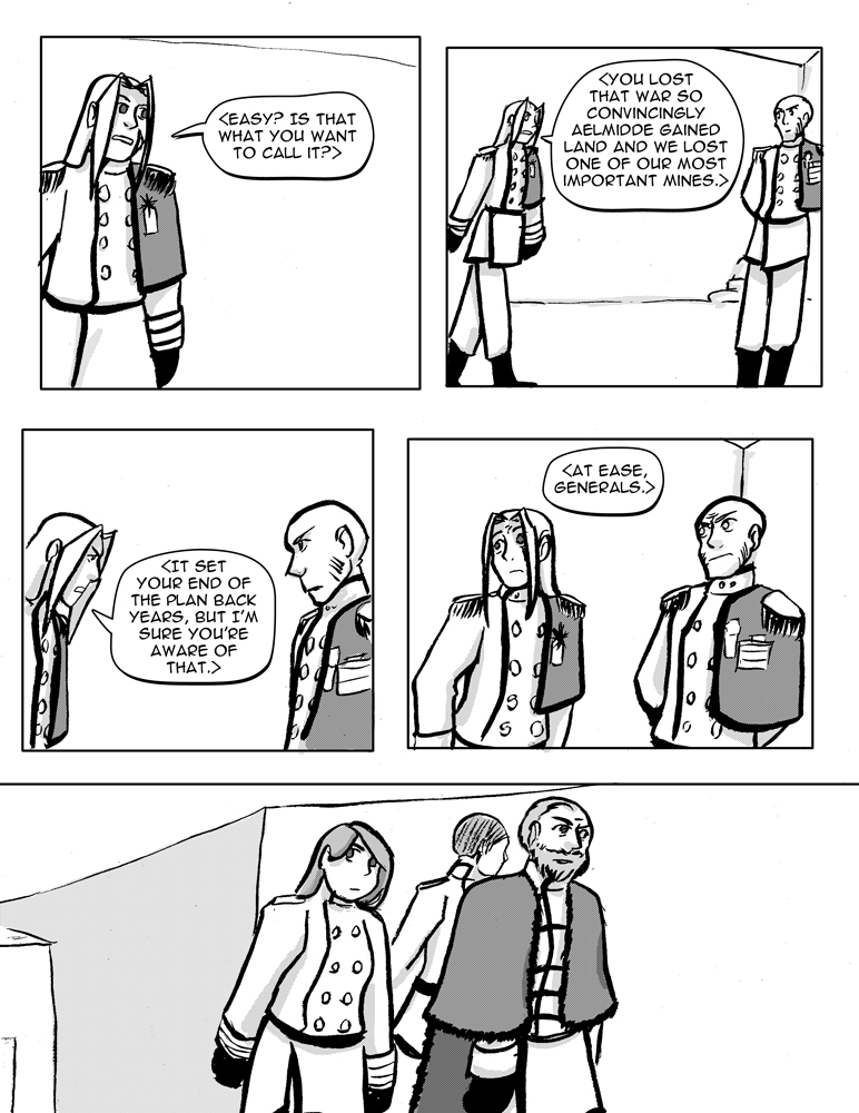
I enjoyed all making these grizzled and beaten up people. All veterans of the previous war (not the king's bodyguards, they are babies), versus most of the people running the opposition, who are too young to have seen much action back then, if any. I wanted it to be clear the north is a harsh place.
I'm not normally a fan of the kind of exposition Tailor's doing here but I justified it as a "saying the quiet part loud" moment.


